Sticks, Sashes and Sunburn: Editing Morris Dancing Photos with a Light Touch
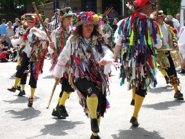
Photo: Anne, CC BY-SA 2.0, via Wikimedia Commons
Morris dancing is brilliant to photograph and mildly terrifying to edit. You’ve got white shirts catching the sun, ribbons in every colour known to man, bells, baldrics, sticks, handkerchiefs, and a village green that goes from flat grey to harsh glare in the time it takes to eat a chip. The temptation is to lean into the “olde England” look — sepia, vignettes, maybe a fake parchment border. Please don’t. The dancers are real people doing a real thing in 2026, not extras in a cosplay advert for mead.
This workflow is for anyone editing a set for a morris side’s website, Facebook page or a local fête programme. It’s about clean, consistent, honest photographs that still look lively. Think “accurate with a bit of polish”, not “Ye Olde Filter Shoppe”.
Start with the cull, not the colour
Before you touch a slider, get rid of the duds. Morris photography produces a lot of near-misses: the moment just after the stick clash, the half-blink, the dancer behind the bloke in the high-vis jacket. Be ruthless but not weird about it. You want enough frames to show the side in action, not a forensic record of every hand position.
Flag the keepers in Bridge or Lightroom, then open the first one in Camera Raw. Work on one image until it looks right. You’re building a recipe, not cooking every plate from scratch.
Fix the exposure before the colour
British fête light is rarely helpful. One minute it’s soft overcast, the next there’s a hard sun cutting across the marquee. Start with the basics: pull back the highlights if the shirts are clipping, lift the shadows enough to see faces under hats, and leave the overall contrast alone for now.
Don’t try to make a dull day look like golden hour. If the sky was flat, let it be flat. A slightly grey sky is part of the story. What you’re after is a photograph that looks like the day you actually had, not a holiday brochure for a county that doesn’t exist.
White shirts without wedding-dress whites
Morris sides often wear white shirts, and white shirts love to blow out. If the histogram is stacked at the right edge, use the Highlights slider and a gentle curve to bring detail back. If it’s truly clipped, don’t paint in fake fabric texture — just accept that a shirt is white and move on.
The trick is to avoid making the whites look blue or cream by accident. Use a Colour Balance adjustment or a selective mask on the shirts and nudge them towards neutral. Check the baldrics and sashes at the same time. If the whites go cold, the reds usually go magenta; if they go warm, the greens turn to pea soup. Neutral is usually safest.
Selective colour for ribbons, sashes and bells
This is where Morris photos get messy. You might have a red baldric, green ribbons, yellow bells and a bright blue gazebo in the background. Global saturation will turn the whole thing into a sweet shop.
Use Selective Colour or Hue/Saturation with masks. Target one colour at a time. Bring the reds under control so the baldric reads as deep red rather than glowing tomato. Calm the greens if the grass is screaming. Leave the bells alone unless they’ve picked up a weird cast — they’re small, shiny and reflective, so they often look brighter than everything else. A tiny bit of desaturation on the bells can stop them twinkling like fairy lights.
If the side has a formal colour scheme, keep it consistent across the set. A red sash should look like the same red sash in every photo, not scarlet in one frame and burgundy in the next because the sun moved.
Faces: keep the sunburn, lose the blotches
Morris dancers are outdoors for hours. They get flushed, shiny and occasionally sunburnt. You can tidy a portrait without erasing the evidence of a long day.
Use the Healing Brush for temporary distractions — a stray crisp packet in the background, a visible plaster, a bit of glare on glasses. For skin, keep it light. A soft-light layer at low opacity can even out tone, but don’t blur the character out of someone’s face. Freckles, laughter lines and a bit of redness are not flaws; they’re the point.
If someone has a genuinely distracting blemish, clone it out at 100% zoom and then check at fit-to-screen. If you can see the retouch from a normal viewing distance, undo it and start again.
Motion: sharpen the sticks, not the hands
Morris dancing is movement. A little motion blur in the sticks or handkerchiefs can look energetic; a lot of motion blur in the face looks like a mistake. Use Sharpen or a High Pass layer on a mask and paint in only the areas that need definition: the eyes, the baldric edge, the stick itself.
Don’t use heavy global sharpening. It makes white shirts look crunchy and turns bells into metallic noise. If the image is soft because of movement, ask yourself whether it’s still usable. A slightly soft frame with great expression often beats a technically sharp frame of someone staring into the middle distance.
Make the set feel like one set
Once you’ve edited your hero image, sync the basic adjustments across the keepers in Camera Raw. Then go back and check each one individually. Morris sets often have mixed lighting — sun, shade, marquee, pub window — so a blanket sync will not be perfect. Fix the outliers by hand.
For the side’s website or Facebook page, consistency matters more than perfection. Same crop ratios, same export size, same amount of contrast. If you’re delivering a gallery, export sRGB JPEGs at a sensible size — around 2000px on the long edge is plenty for web use — and sharpen for screen. Name the files clearly: side-name-village-fete-2026-01.jpg is more useful than IMG_8472-final-final.jpg.
Know when to stop
The best Morris edit is the one that lets the dancing do the talking. Keep the white shirts white, the ribbons readable, the faces human and the sky whatever colour it actually was. If you find yourself adding a vignette, a texture overlay and a fake sun flare, step away from the keyboard. The bells are already doing plenty.
A good set for a morris side should feel like a Saturday afternoon in a British village: a bit scrappy, slightly overexposed, full of character, and better for not being tidied into a folk museum.