Scarlet, Slate and Silence: Editing Remembrance Sunday Photographs Without the Loudness
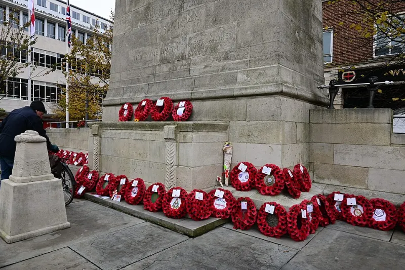
Photo: Hullian111, CC BY-SA 4.0, via Wikimedia Commons
There's a particular kind of November morning in Britain. The light is the colour of dishwater, the wind comes off the car park at an angle, and half the parade is squinting into a drizzle that hasn't quite decided whether it's rain. Then someone lays a wreath, the bugler starts, and you suddenly have about ninety seconds to get the shot.
Later, at the desk, the files look grim. Flat, cool, a bit murky. And the poppies — those glorious, unreasonable reds — are either blown into fluorescent pink or sitting there like dull maroon traffic cones.
This piece is about fixing that without turning a solemn morning into an advert for a camera preset. The edit should serve the photograph. Not the other way round.
First, an honest look at the file
Before you touch a slider, ask what the photograph is actually for. A parish newsletter? A local history group? A print for the family of someone in the frame? Those are three different jobs, and only one of them wants grain and a moody vignette.
Open in Camera Raw or Lightroom and resist the highlights slider on reflex. The two problems here are usually separate: the sky and wet tarmac are too bright and too cool, and the faces under hoods and berets are too dark. Global moves will fix one and ruin the other. Work in two passes.
Protecting the poppy red
Poppy felt is a nightmare. It's a saturated, slightly warm red with almost no detail in the weave, so it clips at the drop of a hat. Once a channel hits 255 there's nothing in there but flat colour, and no amount of cleverness will bring the petals back.
A few practical habits:
- Check your numbers. Hover the eyedropper over a poppy in the Info panel. If red is sitting at 255 across large areas, you've lost it. Aim for something with headroom — a rich red in the low 230s will read as vivid without going neon.
- Use the HSL or colour mixer panel and pull the red luminance down rather than pushing saturation up. That's the single most useful trick for British remembrance imagery: less brightness in the red reads as deeper, more respectful colour.
- In Photoshop, a Hue/Saturation adjustment layer with the red channel selected, then a gentle negative on Lightness, does the same job non-destructively. Mask it to the poppies if the rest of the frame has reds you want to keep.
- Watch the greens. Wet grass and laurel wreaths go radioactive fast when you lift contrast. Keep foliage slightly desaturated and the reds will feel warmer by comparison.
A word on artificial enhancement: do not add glow, sunbeams or a fake warm wash to a war memorial scene. It reads as a greetings card, and greetings cards are not what this day is.
Lifting rain light without flattening faces
Dull weather is actually kind to faces — no hard shadows, no squinting — but it leaves skin looking grey and bloodless. The fix isn't a global shadows lift; that's how you get the waxy, HDR-ish look that makes veterans resemble mannequins.
Try this instead:
- Make a Curves adjustment layer and lift the midtones a touch, then mask it only into the areas that need it. Paint with a soft brush at low opacity around faces, hands, and the pale stone of the memorial.
- Add a second Curves layer set to Luminosity blend mode with a gentle S-curve. It restores local contrast without shifting colour, which matters when half the frame is grey and half is red.
- For the sky and wet pavements, drop the highlights slightly and pull a touch of blue out of the shadows. Wet tarmac reflecting a flat white sky is the most common thing dragging these images down.
- If skin still looks cold, a Selective Color layer with a whisper of yellow and a hair less cyan in the reds and yellows will do more than any warmth slider. Keep it under five percent or you'll be explaining yourself.
Sharpening needs restraint too. Rain and drizzle mean soft edges, and aggressive sharpening turns water droplets into grit. Sharpen at output size, mask it to edges, and skip the faces of anyone elderly unless you're deliberately going for texture.
Removing the modern world, carefully
Cenotaphs sit in the middle of towns. There will be a wheelie bin. There will be a shop sign for a phone repair place, a traffic cone, and quite possibly a discarded coffee cup on the steps.
Clone and heal the small stuff — litter, cables, a stray bollard that clips the frame edge. Use Content-Aware Fill on wet paving where the texture is forgiving. Nobody needs to know about the bin.
What you should not remove:
- People. Not the crowd, not the stewards in hi-vis, not the child fidgeting at the back. The crowd is the photograph.
- Wreaths, names, inscriptions or regimental markings. If a name is in the frame, it stays exactly as it is.
- Anything that changes the story. Don't remove a wheelchair, a walking frame, a damp patch of ground where someone knelt. That's history, not clutter.
- The weather. A grey sky is honest. Replacing it with a dramatic sunset from another file is fabrication, and in this context it's in poor taste.
If you're compositing — say, stitching two frames for a panorama of the crowd — keep it strictly to the same moments, same lens, same exposure run. Merging the two minutes' silence from one service with the march-past from another is not a panorama, it's a fiction.
When to leave it alone
The best Remembrance Sunday photographs I've seen are mostly untouched. A silhouette against a bright sky. A row of berets. A single poppy on wet stone.
If the frame depends on quiet — the stillness of the two minutes' silence, a hand on a shoulder, an old man's face — resist everything. No grain overlay, no film emulation, no black-and-white conversion just because monochrome feels solemn. If you do convert, do it manually with a Black & White adjustment layer and control the channel mix so the poppies don't disappear into the grey. A red filter effect that turns flowers black is a cliché, and it flattens the one colour that carries the meaning.
And if a photograph is technically poor but emotionally true — slightly blurred, slightly crooked — leave it be. Sharpness isn't the point.
A short ethics checklist
Run this before you export, and again before you publish.
- Did I have a reasonable expectation of being allowed to photograph here? Public parades are fair game; private services and interiors often aren't.
- Have I avoided close, identifiable images of people who are visibly grieving?
- Are children in the frame? Do I have the parents' permission, and would I be comfortable if they saw the edit?
- Does the caption tell the truth about where, when and what?
- Have I added, moved or removed anything that changes the meaning of the scene — including wreaths, flags or names?
- Is any retouching on faces limited to light and colour, not structure? Age is not a flaw.
- If someone asked me to take a picture down, would I?
Export and hand over
Save to sRGB for anything going online, keep a full-resolution master untouched, and export a smaller version for the parish council's newsletter — they will thank you, because they're pasting it into a Word document at 11pm. Sharpen for output, keep file sizes sensible, and name files so they can be found again next November.
The edit, in the end, is mostly about subtraction. Take out the noise, take out the cardboard coffee cup, take out your own cleverness. What's left should look like the morning it was.