Behind the Glass: A Considerate Photoshop Workflow for UK Museum Snaps
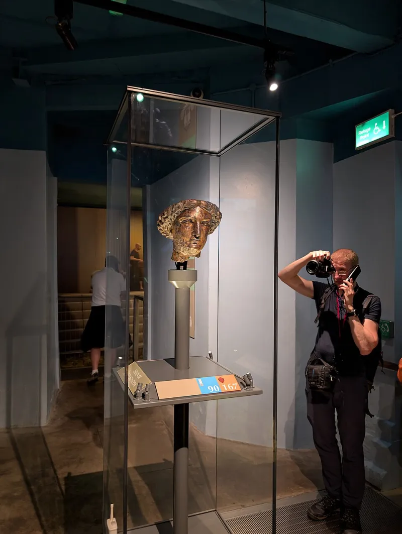
Photo: Andy Li, CC0, via Wikimedia Commons
Walk into any British museum on a wet Saturday and you’ll see the same scene: a row of people holding phones and cameras up to glass cases, trying to capture a Roman coin, a dinosaur femur or a Victorian dress while the room glows the colour of weak tea. Flash is banned, tripods are usually banned, and the light is designed to protect the object rather than flatter your sensor. The result is often a yellow, grainy, slightly crooked file with a ghost of your own coat reflected across the artefact.
That’s not a failure. It’s just a different kind of editing job. The aim isn’t to make the museum look like a studio. It’s to make the object readable, keep the colours believable and leave enough of the room in the frame that the picture still says ‘I was there’. Here’s a calm workflow for Photoshop and Camera Raw that does exactly that — plus a few places to stop.
Start with the light you actually had
Open the raw file in Camera Raw first. If you shot JPEG, duplicate the background layer in Photoshop and work on a smart object so you can revisit decisions. Pull down the highlights if the glass or a white label is clipping, and lift the shadows just enough to see detail in the case. Don’t chase a bright, even exposure; museum rooms are meant to be dim. A little falloff at the edges is honest and often looks better than a flat, over-lifted file. This applies whether you were at the V&A, the British Museum or a local civic museum with one vitrine and a very enthusiastic lighting engineer.
White balance: find a neutral, not a white marble
The yellow cast comes from tungsten and LED mixes, and it varies across the room. Use the eyedropper on something genuinely neutral — a grey card if you carry one, a neutral shadow on a plain wall, or the grey edge of a display label. Avoid sampling the marble bust or the cream painted wall; they may be warm by design. If the result looks too blue, back off. A museum should still feel warm. For mixed lighting, fix the global balance first, then use a masked Color Balance or Curves layer for local patches.
Noise first, sharpening last
High ISO grain is normal in these shots. In Camera Raw, apply luminance noise reduction before any sharpening. Use the Detail panel and zoom to 100% on a textured area — stone, fabric, fur — and stop before the surface turns to plastic. If you have Photoshop’s Denoise feature, use it on a duplicate layer and mask it back if it softens detail. Then sharpen with a mask: Filter > Sharpen > Unsharp Mask, small radius, and a layer mask that excludes smooth glass and plain walls. Over-sharpening grain is the fastest way to make a museum photo look like a phone snap from 2012.
Glass is not the enemy — over-cloning is
Small reflections can be removed with the Spot Healing Brush, but large ones need restraint. Create a Curves adjustment layer, mask the reflection, and pull the highlights down rather than cloning half the case. That keeps the texture underneath. For a stubborn patch, use Clone Stamp from an adjacent area with a soft brush and low opacity, checking at 100%. Content-Aware Fill can work on plain backgrounds, but it will happily invent patterns on a decorated ceramic. If the reflection covers the one detail you wanted, consider a tighter crop instead of a fictional reconstruction.
Straighten, but keep the room honest
Use the Crop tool’s Straighten option and draw along a shelf edge, a plinth or a door frame. Then check the verticals. A slight perspective correction can make a case look less tipsy, but don’t force every shot into a catalogue elevation. If the object was photographed from below, let it be from below. The same goes for colour: use HSL to tame yellow saturation, not to neutralise the whole scene. Gilt bronze should still look gilt; faded textile should still look faded.
The ethics bit: when to stop
Editing a museum photo is not the same as restoring the object. Remove your own reflection, correct the white balance, reduce noise and straighten the frame. Do not rebuild a missing handle, sharpen an inscription into legibility it never had, or change a pigment because it looks ‘wrong’ on your screen. Labels, case edges and gallery context are part of the record. If you post the image, a simple note such as ‘edited for light and glare’ is good practice. Keep a before-and-after layer group in the PSD so you can prove what changed. And if the image is for research or publication, check the museum’s image-use policy before you crop the label out.
A quick checklist for the next visit
Take a grey card or use a neutral reference; shoot raw if you can; brace yourself against a wall; use a fast prime or your phone’s night mode carefully; avoid shooting through two layers of glass; and note the object’s name and gallery. In Photoshop, work in this order: exposure, white balance, noise, reflection control, straighten, local colour, sharpening. Then step back. If the artefact looks like a CGI model, you’ve gone too far. The best museum edits are the ones where the viewer notices the object first and the editing never at all.