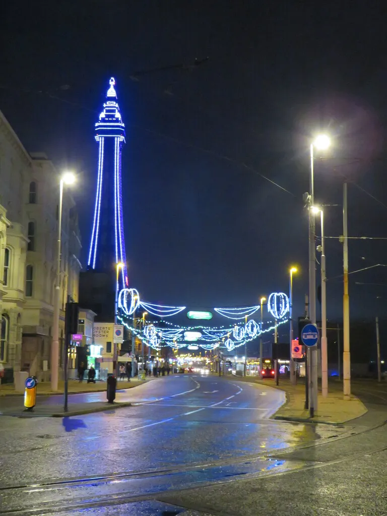
Red, Rain and Reality: Editing UK Street Scenes Without the Souvenir Gloss
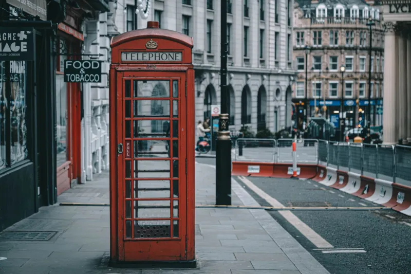
There is a particular red that appears in British street photography. It is not the red of a real phone box on a grey Tuesday in Leeds. It is the red of a fridge magnet: loud, evenly lit, and somehow divorced from the street it stands on. The phone box becomes a logo rather than a thing you could walk up to and open.
The trouble is not the colour itself. A well-kept K6 phone box or a Royal Mail post box is genuinely vivid, and pretending otherwise looks just as false. The problem is what happens when we let that red boss the whole frame. Once it clips, once the pavement goes amber, once every wet patch is pumped up with clarity, the picture stops being a record of a place and starts being a postcard.
This is a workflow for keeping the red, the rain and the local detail honest — while still making a photograph that works on a screen or a wall.
Start with what the camera actually saw
Before touching colour, deal with the basics. Straighten the verticals, especially if you are photographing a phone box or a signpost against a building. A slightly leaning post box is oddly distracting. Crop out the half-bin at the edge of the frame. Resist the urge to crop so tightly that the street furniture has no context; a phone box floating in nothing is a graphic, not a scene.
In Adobe Camera Raw or Lightroom, check the red channel rather than just theRGB histogram. Reds on phone boxes and post boxes can look fine in the composite while the red channel is already pressed against the right-hand side. Pull exposure back slightly if needed, then use the Highlights slider with care. If the paintwork has gone flat and pink, you have gone too far.
A neutral white balance is usually the right starting point for overcast British weather. Do not warm the whole image just to make the red feel richer. That is how pavements turn to toffee.
Treat red as an accent, not a subject
Open the image in Photoshop and make a loose selection around the red object. A Color Range selection can work well, but a hand-painted mask with a soft brush is often more controllable. Feather it slightly. You do not want a hard halo around the box.
Use a Hue/Saturation adjustment layer clipped to that mask. Nudge saturation down by a small amount — often somewhere between five and fifteen points — and pull lightness down a touch if the red is glowing unnaturally. Then use a Curve to add a little contrast inside the paintwork, so the panel edges and rivets still read. The aim is not to dull the red; it is to give it shape.
If a post box looks too orange, shift the hue very slightly towards magenta rather than adding a global colour grade. If a phone box looks too crimson, try a gentler shift towards orange. Tiny moves. Check the image at 100% and then at fit-to-screen. The red should still feel like street furniture, not a warning sign.
Wet weather is texture, not a defect
Rain is one of the reasons British street scenes work. Wet tarmac reflects the red paint, and puddles give you depth. The mistake is to attack every bright speck and every soft reflection as if it were a technical error.
Sensor spots and dust on the lens are worth removing with the Spot Healing Brush. Actual rain streaks in the air are usually part of the atmosphere. If they are distracting, reduce their contrast with a gentle Curves adjustment rather than cloning them out one by one. A little rain reads as weather; a perfectly clean street reads as a studio set.
For reflections, avoid the Dehaze slider as a blunt instrument. It can turn wet pavements into grey concrete and suck the life out of the scene. Instead, use a masked Curves layer to lift or lower the reflected area separately. If a puddle is too bright, bring down the highlights. If the reflection is muddy, add a touch of local contrast — but keep the softness. Wet surfaces are meant to be soft.
Remove the boring clutter, keep the local truth
Modern street clutter is a real nuisance: wheelie bins, cable boxes, parked vans, temporary signs, a stray traffic cone. Photoshop's Generative Fill and Content-Aware Fill can remove these convincingly, but they need a light hand. Work in small passes, not one giant selection. Check the edges where the new fill meets railings, kerbs and paving.
Be more careful with things that tell you where you are. Do not remove street names, fingerpost arms, shop signs or the worn lettering on a post box. Do not relocate a phone box to a prettier corner of the frame. And if a scene includes people going about their day, think twice before erasing them just because they are not picturesque. A street without any life is not more honest; it is just emptier.
A useful test: if a local would look at the finished photo and say the place does not quite look like that, you have gone too far. Removing a bin is fine. Removing the character of the street is not.
Fingerposts and fine detail
Fingerposts are a different challenge. They are often pale, backlit and surrounded by foliage, and the lettering can disappear once you start sharpening. Mask the sign and apply a modest amount of Clarity or a high-pass sharpen layer. Do not chase crispness until the edges glow. If the paint is flaking or the lichen is showing, leave it. That wear is part of the object's age and location.
For phone boxes and post boxes, pay attention to the glass, the notice holders and the black trim. These dark areas give the red something to sit against. If you lift the shadows too aggressively, the box turns into a flat red shape. A gentle shadows lift is usually enough.
A sensible finishing routine
Finish with a neutral grade. A slightly cool shadow and a clean highlight will suit most overcast UK street scenes. Avoid global vibrance boosts; they tend to exaggerate the red and the greens at the same time. Export at a sensible size, apply output sharpening for screen or print, and check the result on a phone. If the red still looks like a souvenir tea towel on a small screen, go back and reduce the saturation mask a little further.
The best street photographs of Britain are not the ones that make the place look like a heritage advert. They are the ones where the red phone box, the wet kerb and the grey sky all feel like they belong to the same afternoon. Keep the colour, keep the weather, and let the street stay itself.