Pillars, Pews and White Balance: Editing Church Interiors for the Parish Magazine
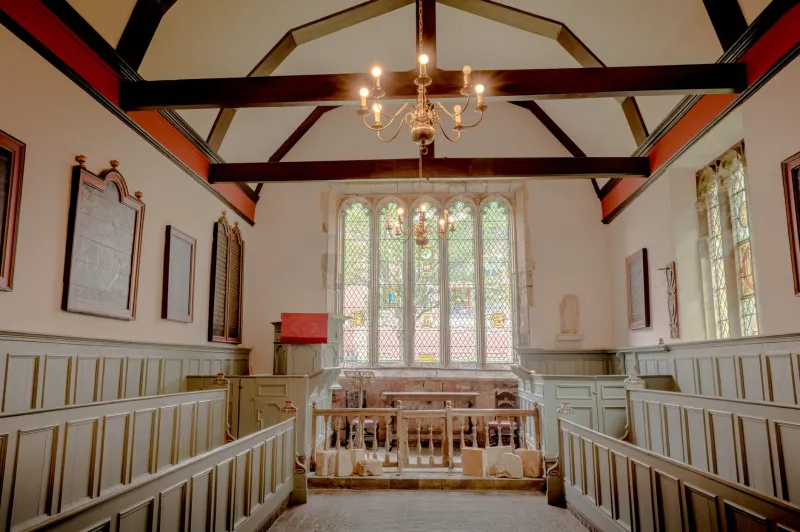
Every parish has one. The person with the half-decent camera who gets asked to photograph the harvest festival, the Christmas carol service, and the inside of the building for the new welcome leaflet. They arrive on a grey Tuesday in November, set up at the back of the nave, and discover that a church interior is basically three photographs fighting each other: cold blue daylight spilling through a west window, warm tungsten sconces on the north wall, and a tea-light stand near the Lady Chapel throwing out more orange than a supermarket car park at dusk.
This is a workflow for that photographer. It's aimed at the practical end of things: a handful of images that need to look right at A5 in the parish magazine, at 1600 pixels wide on the church website, and on the A2 board the PCC puts up for Heritage Open Days in September 2026. No compositing tricks, no fantasy HDR, and absolutely no vicars the colour of a satsuma.
Shoot for the edit, not around it
Before Photoshop gets involved, give yourself something to work with. Shoot raw, always. Bracket three frames two stops apart when the light is genuinely mixed, because you will want a clean highlight frame for the window and a clean shadow frame for the pulpit. Take one frame with a grey card or a colour checker propped on a pew, and shoot a second one with it held near the flagstones at the front. Two reference frames save you twenty minutes of guessing later.
Turn the in-camera HDR off. It welds three exposures together with no say from you, and it flattens exactly the contrast that makes a stone church feel like a stone church. And keep the camera level and roughly at chest height if you can. The less perspective you create on site, the less correction you need later.
First pass: pick the frame, then leave it alone
Open the sequence in Camera Raw and enable the lens profile first. That single click fixes a surprising amount of barrel distortion on the wide end, and it gives the Upright tools a fair starting point. Then cull ruthlessly. If you have nine near-identical frames of the nave, keep two: one exposed for the glass, one for the pews.
Resist the urge to merge everything into an HDR. Nine times out of ten you can take the shadow-friendly frame, bring the highlights down with a masked Linear Gradient over the window, and get a more believable result than a merged file with halos around the arches. If you do merge, use the de-ghosting option at a medium setting, because candle flames and people in the congregation will move between frames.
Three lights, three white balances
The single biggest upgrade to church photographs is local white balance. Global white balance is a compromise nobody enjoys. In Camera Raw, drop a few masks: the stonework and pews (warm, tungsten-lit), the window reveal and the floor near it (cool daylight), and any candles (leave them alone).
Start by neutralising the stonework against your grey-card frame. Stone should read as stone: grey, buff, or pale limestone depending on where you are in the country, not custard. Then nudge the daylight masks very slightly cool, but not so far that the church looks like a dentist's waiting room. A little warmth in the shadows is honest. Warmth everywhere is a filter.
If the vicar or a churchwarden wanders into frame, mask them separately and pull the orange saturation down by maybe ten points. Faces lit by sconces tend to sit high in the red channel, and a small, targeted adjustment does more than dragging the global temperature slider towards blue.
Standing the columns up
Nothing says "amateur snap" faster than a nave where the pillars lean like a row of drunks. Lens Corrections > Upright > Vertical does most of the work, but check it afterwards. Automatic upright can pinch a west tower until it looks like a narrowboat, particularly on ultra-wide shots.
My preference is Guided Upright, drawing two lines up the nearest columns and one across a horizontal course of stone. If the result is nearly there but not quite, use Edit > Transform > Skew and drag the top corners a fraction. Work at 100% zoom, take a breath, and stop while the arches still curve. A perfectly rectangular arch is as wrong as a leaning pillar.
Stained glass that still looks like glass
Here is where most edits go wrong. Someone discovers the shadow and highlight sliders, drags them both to the edges, and the window becomes a flat neon rectangle. Stained glass is beautiful because it has range: deep blues that are almost black, hot yellow-white where the sun comes through, and lead lines holding it all together.
So protect the highlights. Pull them back until the lead cames are visible again rather than a white blur. Lower Clarity and Texture on the window itself, using a mask, to kill any haloing from the earlier corrections. If a window has lost its colour entirely, duplicate the layer, set it to Screen at around twenty per cent opacity and mask it tightly to the glass. Then reduce saturation slightly. Yes, slightly. Real glass photographed in real light is less saturated than memory suggests, and a restrained window sits much better inside a stone frame.
Dark woodwork, flagstones and noise
Oak pews and dark pine roofs are noise factories. Rather than sliding luminance noise reduction up until the carving turns to soap, lift the shadows a little with a masked adjustment, then apply noise reduction at a modest level. Colour noise is the one to attack hardest; a small amount of luminance grain in dark timber is far more acceptable than a smeared, plasticky finish.
Don't crush the blacks to hide the noise. In a church, the dark corners are part of the story. Let the pulpit fall into shadow. What you do want is a little Texture on the flagstones and the carved bench ends, so they don't look like felt.
Candles, cassocks and the finishing touches
Candle flames clip easily. If a flame has gone pure white in all three channels, there's no colour to recover, so expose for it in camera where possible and use a little local Dodge on the halo instead. Warm light on a cassock or a choir robe is fine; warm light on a face is where people notice. Check skin tones at 100%, not on the laptop at an angle.
For output, keep two versions. The print file wants sRGB, 300ppi at the finished size, and a modest output sharpening pass. The web file wants 1600 pixels on the long edge, sharpened a touch more, and a check on an actual phone screen. Parish magazines are printed on paper with all the tonal range of a paper bag, so test a proof if you can: shadows that look lovely on your monitor can turn into one black puddle at A5.
The respectful bit
Two rules worth taping to the monitor. Don't clone out memorial plaques, donors' windows or the mess left by the toddlers' group because it would look tidier. And don't invent architecture. Straighten, brighten, clean up the white balance, remove a sensor spot or two. That's the job.
Get the churchwarden to sign off the final selection before it goes anywhere near print, and credit the photographer in the magazine. A calm, honest edit of a nave in November will do more for the building fund than any amount of HDR glow.