Canal Light, Cabin Shadows and Chipped Paint: Editing Narrowboat Photos Without the Brochure Gloss
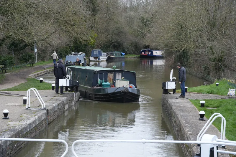
Narrowboat holidays are wonderful because they are slightly awkward. The boat is narrow, the locks are heavy, the sky is often grey and the paint is usually chipped somewhere. That awkwardness is also what makes the photos worth keeping. The risk in Photoshop is turning a damp week on the Shropshire Union into a glossy hire-boat brochure where every brass fitting gleams and the water looks like bottled tonic.
This workflow is about honest enhancement. You want straighter lock gates, cleaner colour and a bit more presence, but you still want the viewer to feel the drizzle on the towpath and see where the paint has worn thin. Here is how I approach canal-boat photos in Photoshop, whether you are editing a 2026 trip or finally getting round to a folder from a previous summer.
Start with the truth of the file
Open the raw file in Camera Raw as a smart object. Resist the urge to hit Auto and move on. Auto is often too keen on bright skies and punchy blues, and canal scenes are rarely punchy. Check the histogram, set a sensible white balance and correct lens distortion. Wide shots from the back deck often have a slight barrel bend, and the boat itself can lean in the frame. A little lens correction helps, but do not straighten the life out of the scene.
If the photo was taken under a flat grey sky, accept that the light was flat. You can add shape and contrast later, but you cannot invent a golden-hour sky without making the whole image feel false.
Straighten the lock gates, not the whole world
Lock gates are a useful upright reference, but they are not always perfectly vertical. Brickwork, stone edges and the sides of lock cottages are usually better guides. Use the Crop tool with the Straighten option, or draw a guide along a reliable vertical. If the boat is tilted but the lock gate is straight, leave the boat alone. A slight lean is part of being on the water.
For wider canal shots with converging verticals, try Perspective Warp on a duplicate layer. Keep the correction gentle. A lock cottage should look like a lock cottage, not a theatre set. If the towpath slopes naturally, do not force it level just because a grid line says so.
Water: tame the green without turning it to gin
Still canal water picks up reflections of trees, algae and the sky, and it often carries a green cast. That cast is real, but it can dominate the frame. Add a Hue/Saturation adjustment layer and target the greens and cyans. Pull saturation down by around 10 to 20 points and nudge the hue only if the water looks radioactive. Use a mask so you are not desaturating the hedgerows at the same time.
Selective Color is useful for a more controlled fix. In the Greens and Cyans channels, reduce the black or magenta slightly to calm the cast. Avoid pushing the water towards pure blue; British canals are not swimming pools. If the reflection is the point of the picture, protect it with a luminosity mask and lift the shadows just enough to show the shapes of trees or bridge arches.
Keep Clarity moderate. Too much Clarity on rippled water creates a crunchy, metallic texture that looks nothing like a canal on a Tuesday morning.
Overcast skies are not a fault
A white-grey sky is standard issue on many UK canals. Do not replace it with a dramatic sunset unless you genuinely want a composite. Instead, use a gradient mask on a Curves layer to add a little contrast to the sky while keeping the land natural. Pull the highlights down carefully to recover cloud texture where it exists. If the sky is completely blown, leave it mostly alone. A soft, bright sky can suit the scene.
A common mistake is adding too much Dehaze. It can make drizzle look like a dust storm and turn distant trees into dark cut-outs. Use it at a low setting, or skip it and use a gentle S-curve instead.
Brass and paint: the saturation trap
Brass fittings, red paintwork and blue hulls are where heavy-handed editing shows up first. A small saturation boost can make brass look like neon and red paint look like a warning sign. Use Vibrance rather than Saturation for a start, then open a Hue/Saturation layer and target the individual colours. Reds, yellows and blues often need a small reduction, not a boost.
For brass, use a Curves adjustment to add depth to the midtones and warm the highlights slightly. Do not push the yellows until they glow. For painted panels, use dodge and burn on a 50% grey layer to shape the light along the edges. This gives the paint presence without turning it into plastic.
And please keep the chips. Spot Healing is for sensor dust and small distractions, not for removing the evidence that the boat has been through a few locks. If a mooring rope or fender is in the frame, ask whether it adds to the story before cloning it out.
Cabin interiors: tiny windows, big contrast
The inside of a narrowboat is a lighting challenge. Small windows let in bright daylight while the cabin itself is dim and often lit by warm bulbs or cool LEDs. Start by lifting the shadows in Camera Raw, but keep an eye on noise. Then use a Curves layer with a mask to brighten the interior only. Pull the window highlights down separately so the view outside is not a white rectangle.
Mixed lighting is normal. Use Color Balance to neutralise any obvious green or magenta cast, but do not make the cabin clinically white. It should feel snug, not like a showroom. Selective noise reduction on the shadow areas helps, but avoid smearing the wood grain and fabric textures.
Straighten shelves and cupboard lines if they are distracting, but leave the slight wonkiness of an old boat alone. It is part of the charm.
Drizzle, chips and the final check
Drizzle can look like noise, so be careful with sharpening. Use a mask to sharpen the boat and lock gear while leaving the sky and water softer. A tiny amount of grain can help a heavily lifted interior feel more natural, but do not add grain just for the sake of it.
Before exporting, compare the edited version with the original. Ask yourself whether it still feels like the trip. Can you see the weather, the wear and the age of the canal? If every surface looks polished and every sky looks dramatic, you have gone too far. Back off the saturation, soften the contrast and let the chipped paint do its job.
A simple order of work
- Open the raw as a smart object and correct lens and white balance.
- Straighten using reliable verticals, not the boat.
- Tame green water with a masked Hue/Saturation or Selective Color layer.
- Add gentle sky contrast with a gradient-masked Curves layer.
- Reduce saturation on brass and painted panels; keep the chips.
- Lift cabin shadows with masks; protect the windows.
- Sharpen selectively and compare with the original before export.
A good narrowboat photo should feel like a memory of a real week, not an advert for a hire company. Keep the brollies, keep the drizzle and keep the paintwork honest. That is the edit worth making.