From Flat to Fantastic: A Practical Photoshop Rescue Plan for Drab British Landscapes
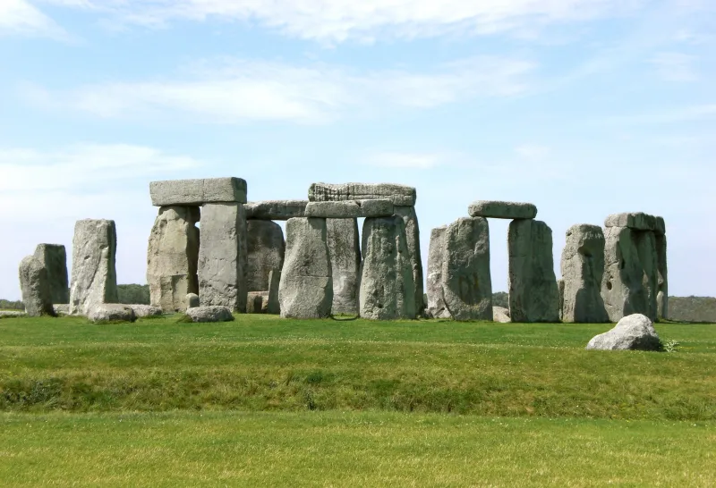
Photo: Benh LIEU SONG (Flickr), CC BY-SA 4.0, via Wikimedia Commons
If you shoot landscapes in the UK, you eventually collect a hard drive full of images that look... fine. Not bad, just flat. The sky is a sheet of grey, the greens are muted, and the hills have all the depth of a tea towel. A wet afternoon in the Peak District is a familiar example: moody in person, slightly lifeless on screen.
The temptation is to drag the Saturation slider to the right and hope for the best. Please do not. Flat light can be rescued, but it needs a sequence: contrast first, colour second, and a lot of restraint throughout. Here is the workflow I use in Photoshop when a British landscape needs a gentle lift rather than a full makeover.
Start with an honest assessment
Open your image and duplicate the background layer. Before you touch anything, press the backslash key to compare the original with your current view. That before/after toggle is your reality check. Put every adjustment into a layer group called Edit, so you can switch the whole lot on and off later. If the photo only works when the effect is at 100 per cent, it probably does not work.
Step 1: Set the foundation in Camera Raw
Use Filter > Camera Raw Filter. Treat this as your base exposure and contrast pass, not a colour playground. Nudge Exposure if needed, then pull Highlights down and lift Shadows slightly. Add a small amount of Whites and Blacks to restore the ends of the histogram. Texture is useful for rock and foliage; Clarity should be used sparingly, especially on misty scenes. Dehaze is powerful and easy to overdo, so keep it below about 10 unless the image is genuinely hazy.
For the Peak District example, I would start with Shadows +15, Highlights -20, Texture +8, Clarity +5 and Dehaze +4. Those numbers are not a recipe. They are a reminder to make small moves and check the before/after often.
Step 2: Build contrast with Curves
A flat image usually needs contrast in the right places, not contrast everywhere. Add a Curves adjustment layer and make a gentle S-curve: lift the highlights a touch, lower the shadows a touch, and leave the midtones alone. Keep it subtle. Then add a second Curves layer, but this time use a mask to target the sky or the foreground separately. If the sky is bright and the land is dark, treat them as two different problems.
Use the backslash toggle after each layer. If you cannot see a clear improvement, reduce the layer opacity or delete it. Photoshop is not a competition to see how many adjustment layers you can stack.
Step 3: Bring colour back with Selective Colour
This is where UK landscapes often come alive. Add a Selective Colour adjustment layer. In the Greens, add a little Cyan and reduce Magenta if the grass looks tired. In the Blues and Cyans, adjust the sky without making it electric. In the Yellows, tame any bracken that has turned neon. The aim is believable colour, not a postcard from a parallel universe.
A useful trick is to use a Hue/Saturation layer with a mask for the sky and another for the land. Reduce saturation slightly on the greens, then add a touch of saturation to the blues in the sky. If the image has a strong colour cast from overcast light, a Color Balance layer can neutralise it, but keep the effect modest.
Step 4: Use luminosity masks for depth
Luminosity masks sound technical, but the idea is simple: they let you edit the bright, dark or midtone areas separately. You can build them in the Channels panel with Calculations, or use a dedicated panel if you have one. For this workflow, make a midtone mask and use a Curves layer to add gentle contrast to the middle values. Then make a highlights mask and add a soft glow with a low-opacity Screen layer, masked to the sky.
This is the step that gives flat images a sense of depth. It also stops you from applying global contrast that makes shadows look crunchy. If you are new to luminosity masks, start with one midtone curve and one highlight curve. That is enough for most UK landscapes.
Step 5: Dodge and burn, but gently
Create a new layer, fill it with 50 per cent grey, and set the blend mode to Soft Light. Use a soft brush at a very low opacity, maybe 5 to 10 per cent. Paint white on areas you want to lift, such as a path or a ridge line. Paint black on areas you want to deepen, such as the base of a tree or a shadowed valley. This is digital dodging and burning, and it is far more controllable than using the old tools directly on the image.
The goal is not to create fake light. It is to guide the eye through the frame. If you can see the brush strokes, you have gone too far.
Step 6: Check the before/after and finish
Press the backslash key again. Toggle your Edit group. Look at the image at 100 per cent and at fit-to-screen. Check for halos around trees, colour noise in the sky, and shadows that have turned into black holes. Add a subtle vignette if it helps, but avoid the heavy dark corners that were popular a decade ago. Sharpen for output, convert to sRGB if needed, and save a copy.
The honest Peak District example
Imagine a wet afternoon near Mam Tor. The original has a pale sky, soft green fields and very little separation between the hills. After the Camera Raw pass, the image has more shape. After Curves, the foreground has weight. Selective Colour brings back a hint of blue in the sky and stops the grass looking grey. Luminosity masks add depth without crunch. Dodge and burn lifts the path and darkens the valley edge.
The final image should still look like a rainy day in the Peak District. That is the point. You are not replacing the weather; you are helping the viewer see the atmosphere that was already there.
Common mistakes to avoid
The biggest one is over-dehazing. It can turn a soft British sky into something that looks like another planet. The second is maxing out Clarity, which makes foliage and stone look gritty. The third is adding saturation to every colour at once. Be selective. The fourth is forgetting the before/after toggle. Use it constantly.
Final thoughts
Dull light is not the enemy. Flat processing is. With a gentle Camera Raw pass, a couple of Curves layers, some selective colour work and a little luminosity masking, you can give UK landscapes the depth they deserve without pretending they were shot in the Mediterranean. Keep the edit honest, keep checking the before/after, and your grey days will start looking like proper photographs.